Multiple ClientsI’ve rebranded commercial office buildings at a variety of levels, from quick and dirty logo redesigns to iterative and layered full rebrands. Some building owners want to attract tenants in the non-profit world, while others seek out high-end, law firm and banking tenants. Accurate first impressions turns leasing interest into leasing action.
909 E Street is an industrial style 6-story building in DC’s Penn Quarter neighborhood. The brief required a rebrand that connected to the building’s architecture and targeted fun, non-profit tenants. I paid homage to the iron work, exposed brick, and column beams in this historic building.

Original 909 E Logo
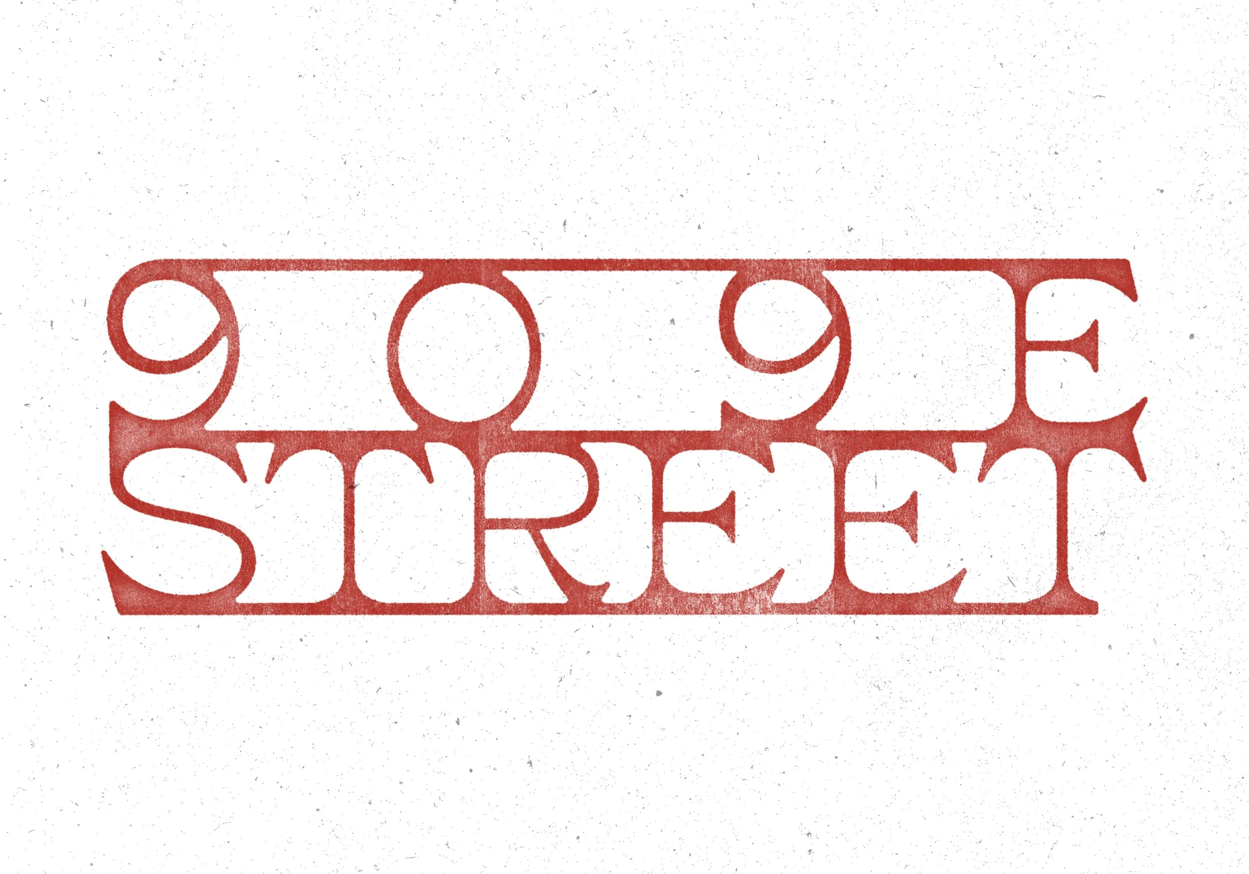
909 E Logo Redesign
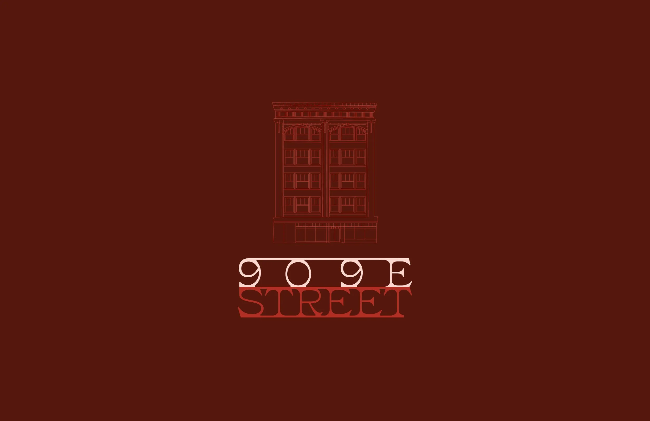
909 E Logo Redesign
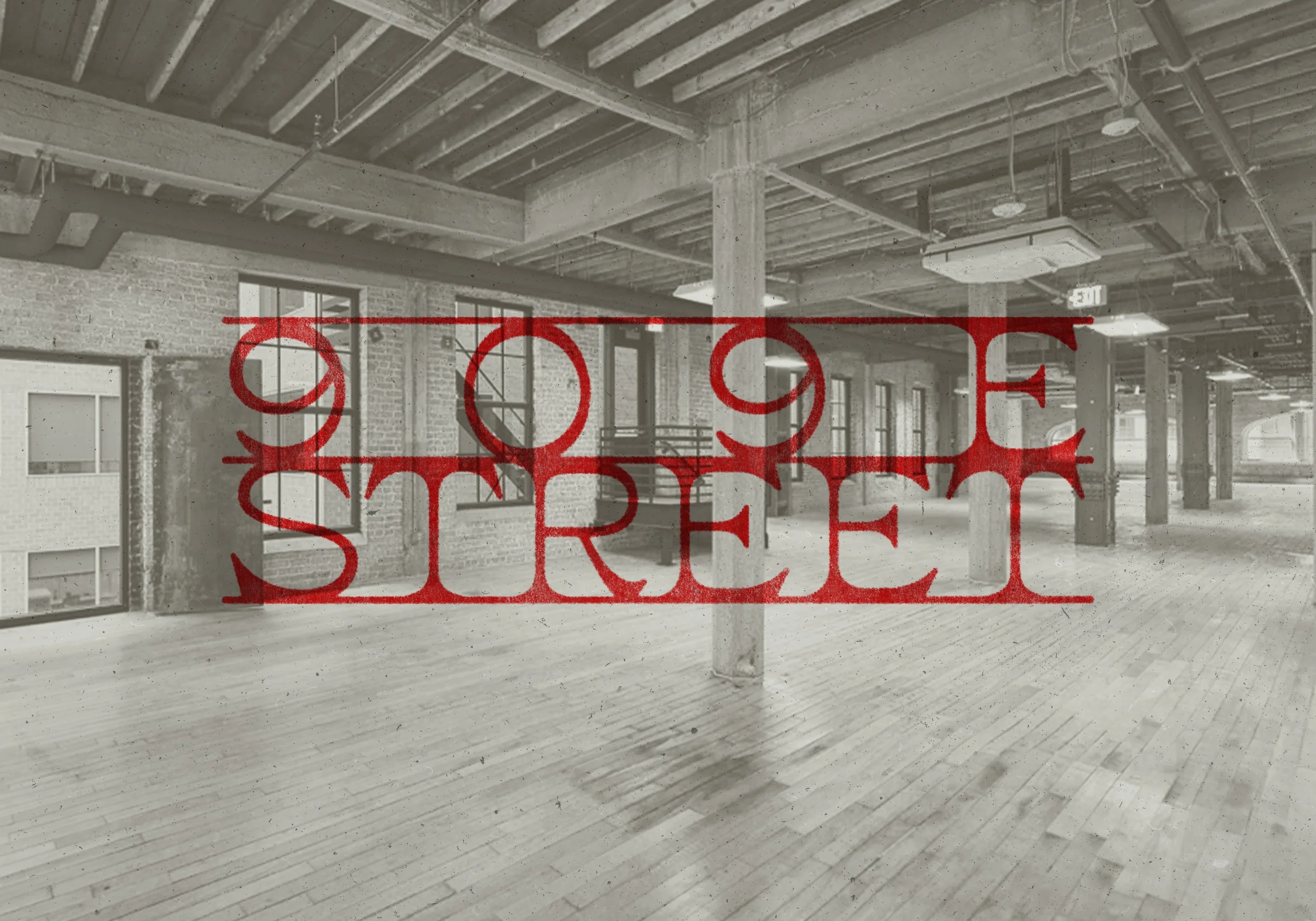
909 E Logo Redesign
Today, 1100 New York Avenue is an office building that just completed a massive building renovations. Its former life was DC’s Greyhound bus station, a historic one at that. The rebrand needed less art-deco and more connection to the rich history of “The Greyhound Building.”

Original 1100 New York Logo
Rebranded 1100 New York Logo
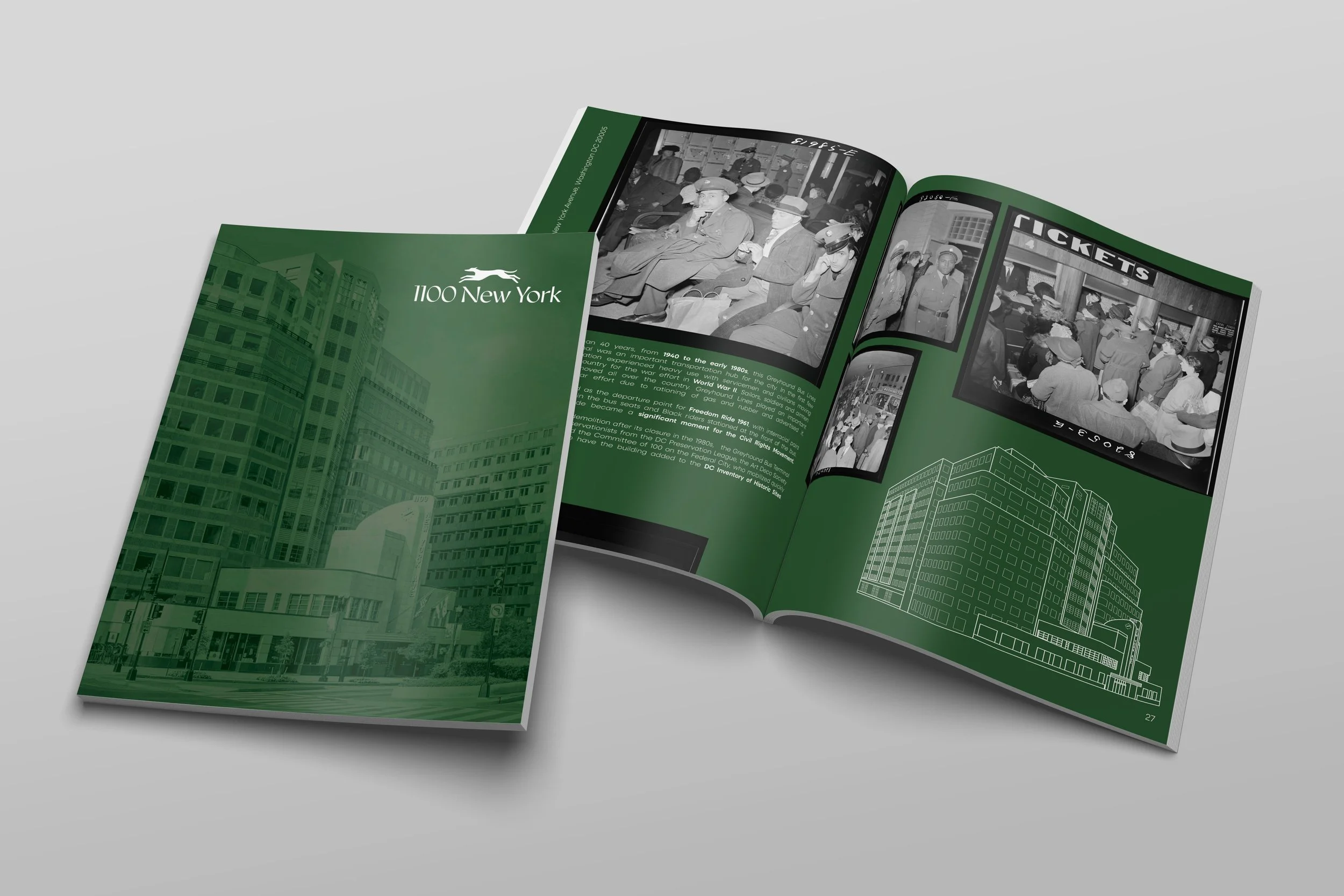
Rebranded 1100 New York Brochure
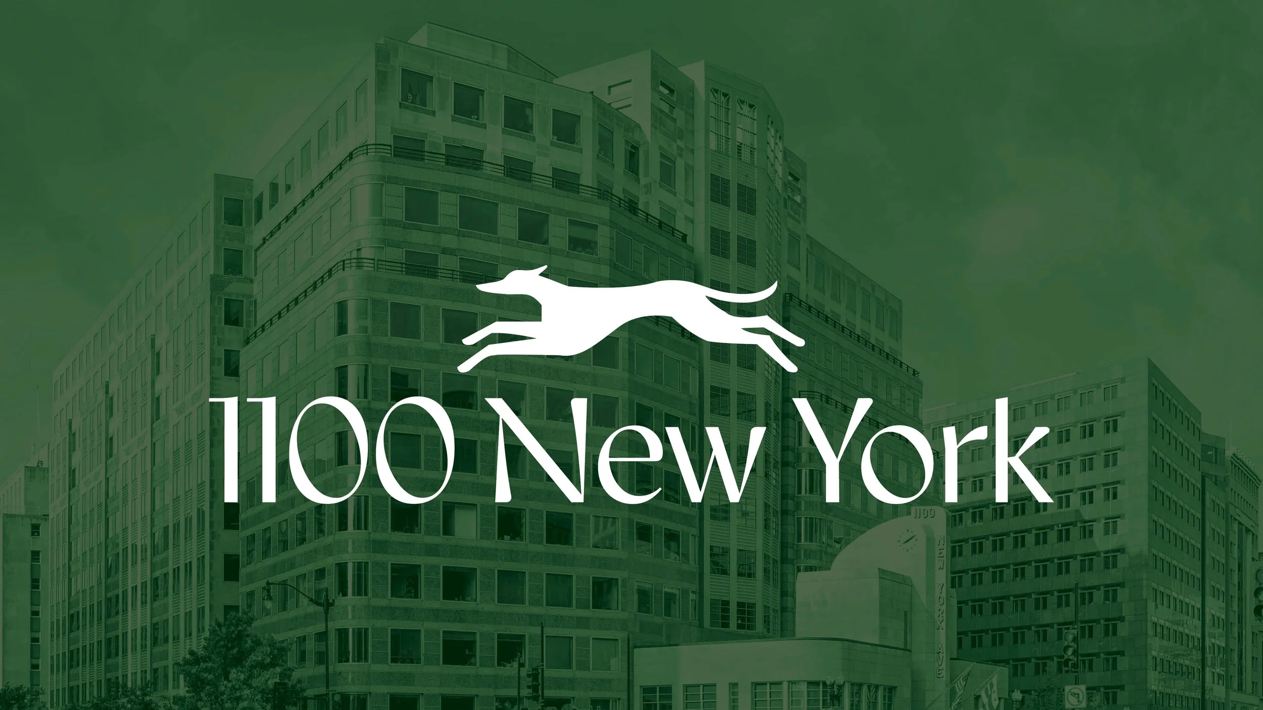
Rebranded 1100 New York Logo
One Thomas Circle wanted to maintain a strong presence without the bold colors. New renovations prompted a redesign of the marketing materials with a focus on clean, upscale, but still friendly.
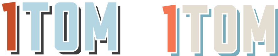
Original One Thomas Logos/Colorways
Rebranded One Thomas logo
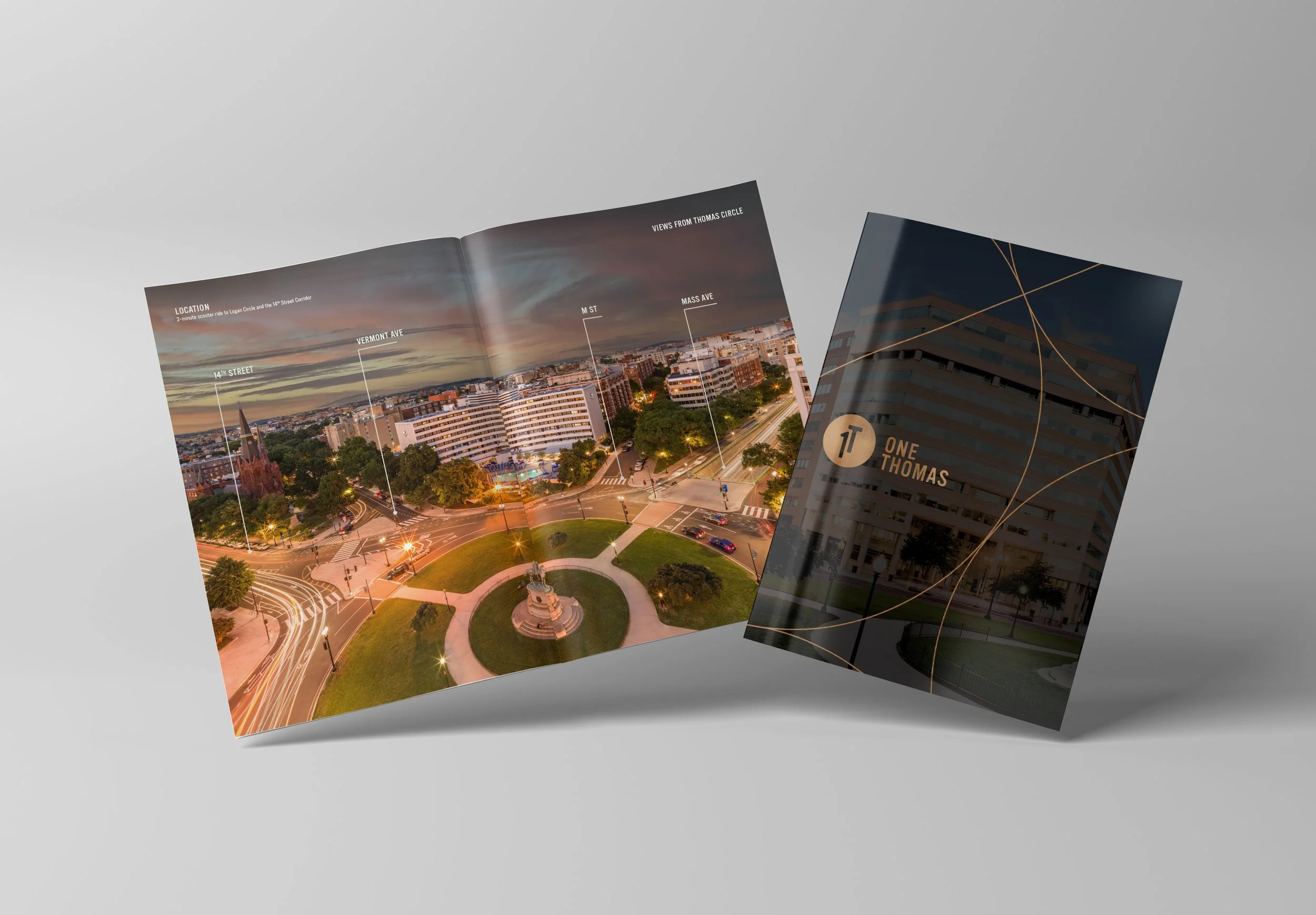
Redesigned One Thomas Brochure
Rebranded One Thomas Logo
2020 K was a great building skating by without branding that reflected its beautiful facade and artistic interiors. When our team took over the listing, we wanted the building to exude a light and elegant vibe.

Original 2000 K Logo

Rebranded 2000 K Logo
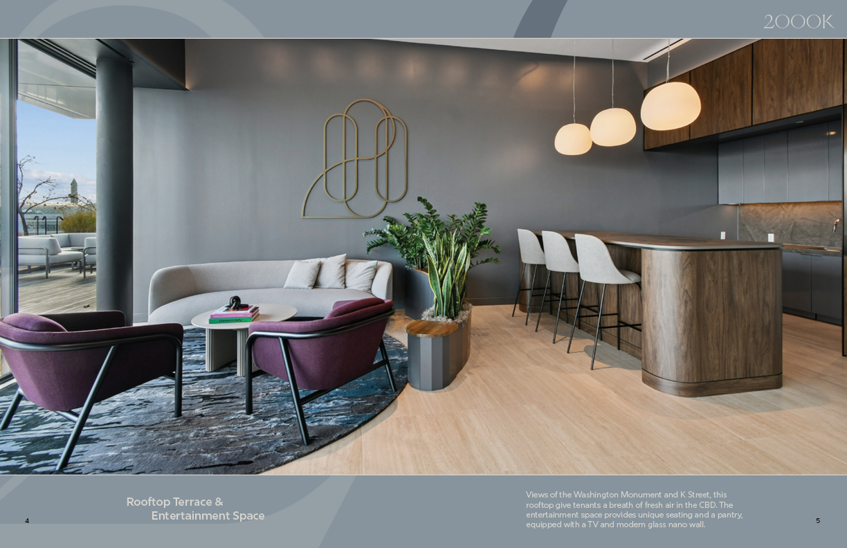
Redesigned 2000 K Brochure

Rebranded 2000 K Logo